
Finding the best paint colors for renters isn’t as obvious as one might think.
Owners want shades that refresh a space, require less touch-up between tenants, and help properties rent faster.
Renters, meanwhile, look for calming tones and a backdrop that works well with their own furniture and art.
So, which paint color will fit both of these requirements?
Both sides benefit from paint choices that balance easy maintenance with personal expression.
Neutral Sherwin-Williams options like Agreeable Gray and Alabaster consistently stand out for their soothing appeal and ability to make a rental property feel like a welcoming home.
The right color doesn’t just freshen walls—it encourages people to imagine themselves living and thriving in the space.
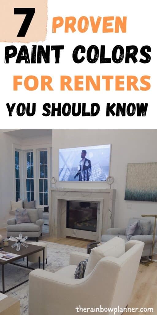
Why Paint Color Matters in Rentals
The paint color you choose isn’t just about filling a wall—it’s about setting the tone for a space where memories are made, and the first impression counts.
For rental homes, finding the best paint colors for renters shapes how quickly a place rents, how well it holds up to daily life, and how easy it is for people to picture themselves living there.
With color, you do more than decorate; you influence comfort, mood, and value for both renter and owner.
 Photo by Steve Johnson
1. Curb Appeal and First Impressions
Color does the heavy lifting before anyone even steps inside. An appealing, fresh paint job on the exterior can instantly set a welcoming tone.
The same principle applies as soon as a prospective tenant opens the door.
A neutral interior, such as Sherwin-Williams’ Alabaster, whispers calm sophistication and makes every room look clean and bright.
These colors help the space look move-in ready, simplifying the process for both landlord and renter.
2. Practical Benefits for Owners
Paint isn’t just about looks—it’s an investment in protecting your property. Landlords know that the best paint colors for renters are more than just shades on a chart.
Reliable colors like Sherwin-Williams’ Agreeable Gray or Shoji White hide minor scuffs, are easy to touch up, and resist fading.
Neutral paints minimize the need for frequent repainting, making turnovers less costly.
- Easier repairs: Touch-ups blend more seamlessly with neutrals.
- Longevity: Quality paint and timeless shades stay fresh-looking longer.
- Appeal to a wider audience: Most renters prefer a simple canvas for their décor.
3. Flexibility and Personalization for Renters
A rental home should be easy to make your own.
Versatile paint colors allow for creativity. These choices give renters a clean backdrop where art pops, furniture fits, and every personality feels at home.
The right color doesn’t limit individual style—it quietly supports it.
- Freedom to style: Muted colors welcome a variety of décor.
- A sense of calm: Soft neutrals help everyone relax after a move.
- Reflects light: Lighter shades brighten spaces, making small rooms feel bigger and more inviting.
4. Influence on Mood and Well-Being
Color affects how we feel. A cool blue or gentle gray fosters relaxation. Warm off-whites can make a chilly space feel cozy.
Research shows that color influences emotions and how people connect with a space.
The best paint colors for renters support a peaceful atmosphere, helping a new place quickly feel like a true home.
Making a smart color choice is about more than style—it’s about shaping daily life, saving time and money, and building a space that welcomes everyone.
Top Qualities in the Best Paint Colors for Renters
Choosing the best paint colors for renters goes beyond simple shades on the wall.
Owners and tenants both benefit when a color serves multiple needs: flexibility, easy upkeep, and broad appeal.
Whether making a property shine between leases or providing a welcoming backdrop for personal style, the right paint choice does some heavy lifting on all fronts.
Versatility for Changing Tastes and Furniture
A great rental needs to adapt. People bring in new couches, paintings, and pillows.
The right paint colors give renters a seamless way to style their space, whether they favor bold art, cozy knits, or modern design.
- These neutral bases soften bright accent pieces and enrich warmer wood.
- Versatile shades never clash, so renters can refresh décor without worrying about the walls.
- Owners see faster turnovers because most potential tenants can picture their lives in the space.
Durability and Easy Maintenance
Rental walls take a beating. Bags scrape, furniture bumps, and kids’ hands leave smudges. The best paint colors for renters often come in durable finishes that stand up to these tests.
Satin or eggshell finishes from Sherwin-Williams, for instance, strike a balance. They’re easier to clean than flat finishes, yet don’t highlight wall flaws the way glossier paints do.
A simple, wipeable paint makes cleaning quick between tenants. Minor blemishes are less obvious with neutral tones, which means fewer major touch-ups for landlords.
Timeless, Universal Appeal
Trends shift, but certain colors never go out of style.
Paint colors like Accessible Beige and Repose Gray from Sherwin-Williams continue to top lists for rental must-haves because they suit almost any taste.
These hues don’t overwhelm a room but still make the place feel updated and bright.
- They look fresh with both light and dark furniture.
- Subtle warmth or a hint of gray provides modern polish without feeling sterile.
- Universal shades help listings stand out online and during showings.
Ability to Reflect and Amplify Natural Light
Good paint choices make the most of a rental’s windows and layout. Light colors reflect sunshine, making rooms feel larger and sunnier. This is especially important for small apartments or townhomes that need a bit more brightness.
- Alabaster, with its creamy undertone, helps maximize light in dim spaces.
- Lighter grays handle harsh sunlight without looking stark or cold.
Renters love the open, airy feeling, and owners appreciate how this effect can boost property photos and appeal.
Ease of Touch-Up and Consistency
Life happens, and sometimes so do tiny wall marks. The best paint for rental homes lets you fix scuffs and patch holes without obvious mismatching.
Sherwin-Williams keeps their core neutral colors consistent year after year, which means you can touch up Agreeable Gray months after painting and get a seamless blend.
- Staying with tried-and-true shades means fewer color-matching headaches for owners.
- Renting families won’t stress as much about minor accidents, knowing repairs are easy.
In short, the best paint colors for renters balance comfort, durability, and lasting appeal, benefiting both those who call the space home and those who manage the property.
Best Neutral Paint Colors for Rentals: Sherwin-Williams Inspiration
Choosing the best paint colors for renters often means finding that ideal neutral—a color that fits any style but still feels inviting.
Sherwin-Williams is known for its range of neutrals, with options that cater to both landlords looking for easy upkeep and renters hoping to turn any space into a personal haven.
The right neutral makes a great first impression, holds up to regular traffic, and plays nicely with every piece of furniture or décor.
Let’s dig into three standout choices from Sherwin-Williams that continue to gain praise in the rental world.
Agreeable Gray: Versatile and Inviting
Agreeable Gray by Sherwin-Williams is a crowd-pleaser for good reason. This soft gray has just enough warmth to avoid feeling chilly but enough coolness to pair with almost any color scheme.
For property owners, it means fewer calls for repainting between tenants, and for renters, it’s the freedom to experiment with pops of color.
This shade provides a gentle, airy backdrop without stealing the spotlight.
- Blends in anywhere: Agreeable Gray looks at home in every room—bedrooms, living spaces, or even kitchens.
- Modern but timeless: It doesn’t bow to fleeting trends; it always feels current.
- Easy to touch up: A consistent favorite, so it’s simple to match if walls need a refresh.
Designers say it “plays well with others”—imagine it next to white trim, natural wood, or bright textiles.
If you’re looking for inspiration or exact details, Sherwin-Williams highlights Agreeable Gray as one of their best-selling neutrals.
Alabaster: Warm and Timeless
Alabaster brings a gentle warmth, making it a perfect fit for rentals where you want a sense of comfort without straying into stark territory.
This color almost glows in natural light, lifting dark hallways and small bedrooms with a soft, creamy tone that never looks dingy.
- Invites flexibility: Works with everything from farmhouse to sleek modern décor.
- Amplifies light: Helps small or windowless rooms feel open and fresh.
- Always in style: Alabaster has become a go-to for owners focused on both curb appeal and longevity, with support from designers and renters alike.
Repose Gray: The Modern Classic
Repose Gray is another excellent choice for anyone seeking the best paint colors for renters.
The beauty of Repose Gray is its chameleon-like quality: it reads more warm or cool depending on the room’s light and the colors you pair with it.
That makes it the modern neutral of choice for both seasoned landlords and meticulous tenants.
- Effortless pairing: Looks stunning next to hardwoods, stainless appliances, and bold accent rugs.
- Versatile mood: Feels calm and sophisticated in daylight, cozy in the evening.
- Hides minor marks: Light enough to bounce light but saturated enough to conceal small blemishes.
Repose Gray stands the test of time, especially in high-traffic areas or multipurpose rooms.
These three colors combine everything a rental needs: adaptability, universal appeal, and a touch of personality, encouraging a quicker turnover while making a new space feel instantly like home.
For a closer look at how to style these shades, see more tips on choosing enduring neutrals for any property type.
Beyond Neutrals: Color Ideas that Work for Renters
Most rental homes stick with tried-and-true neutrals, but there’s room to be bold without taking big risks.
If you’re tired of plain grays and whites, yet still need a color that’s easy to refresh between tenants, you’re in good company.
Color can add personality and charm while keeping maintenance easy for owners and flexibility open for renters.
Let’s look at inviting shades that go beyond basic beige—and why these choices might just be the smart middle ground you need.
Soft Sage and Muted Greens
Gentle green tones—think sage or pistachio—offer a calm, natural vibe that renters often crave.
These shades work especially well in bedrooms, bathrooms, or anywhere you want a serene, restorative space.
As a bonus, muted greens act as a bridge between neutral walls and colorful décor, so the space stays versatile.
Sherwin-Williams’ Clary Sage or Sea Salt are top picks for a refreshing change that still suits many tastes.
Why consider muted green?
- Soothing and timeless: Green feels cozy but not overpowering.
- Pairs well: Matches light woods, crisp whites, or brass fixtures.
- Hides wear: Soft greens mask minor marks or dust.
Warm Taupe and Beige
Goodbye to cold grays. Taupe and beige shades hit a sweet spot: they add a sense of cozy warmth while still giving an updated, modern look.
Sherwin-Williams has winners in choices like Accessible Beige or Natural Tan. These hues adapt well to changing furniture trends, which keeps owners and tenants happy.
Why warm taupe or beige work:
- Not too dark: Light enough to keep rooms airy, but offer depth beyond stark white.
- Versatile: Complements both bold and neutral furnishings.
- Easy maintenance: These colors camouflage scuffs and are simple to touch up.
Subtle Blues and Soft Pastels
Blue doesn’t have to mean beach-house bright.
Think about Windy Blue or Upward fromSherwin-Williams which add a peaceful touch without overwhelming the space.
These shades look clean with white trim, while still lending the home a gentle twist on classic neutrals.
Why subtle blue is a smart option:
- Calms the mood: These colors help people relax after a move or a busy day.
- Brightens the space: Works great for small rooms or bathrooms.
- Refreshing yet rental-friendly: Not likely to offend, easy to cover later if needed.
Rich Accent Walls
When full-room color feels too bold, a single accent wall can easily spice up a rental without locking the next tenant into one style.
Deep greens, navy, or even a muted burgundy work well with soft gray or beige backgrounds. The benefit? You can create visual interest that’s easy to paint over at turnover.
Ideas to try:
- Entryway feature: A bold color by the entry adds style right away.
- Bedroom focal point: A deep wall behind the bed dresses up the space.
- Balance: Keep three walls neutral for flexibility, then let one wall sing.
Final Thoughts on Paint Colors For Renters
Choosing the best paint colors for renters brings lasting benefits for both landlords and tenants.
Sherwin-Williams shades like Agreeable Gray, Alabaster, and Repose Gray stand out because they help a property look clean, fresh, and easy to personalize.
These hues make touch-ups quicker, cut down on turnover work, and attract more applicants—all while giving renters a space where their style shines.
Light neutrals and gentle accent colors offer a flexible base that supports comfort and creativity, while practical finishes make cleaning and repairs simple.
Careful color selection helps a rental feel like home from day one. This approach pays off in faster leasing, higher satisfaction, and smarter long-term care for the space.
Thank you for reading, I hope this help!
Other Reads: