
Finding the perfect farmhouse wall colors brings a touch of rustic charm and warmth to any space.
These hues aren’t just about paint—they’re key to creating a cozy, inviting atmosphere that mirrors the simplicity and beauty of country living.
From muted neutrals to soft, earthy tones, the right colors can completely transform a room.
Here we’ll explore how to use these shades to set the perfect tone in your home.

What Is the Farmhouse Aesthetics
The classic farmhouse aesthetic has been capturing hearts for its understated charm and authentic simplicity.
It embodies a style that feels lived-in, purposeful, and warm.
Whether you’re designing an entire home or selecting the perfect farmhouse paint colors, understanding its essence can help tie your vision together beautifully.
Historical Influences on Farmhouse Design
Farmhouse design originated from the simple, practical needs of rural families.
Historically, everything in a farmhouse was built to last, with local materials and crafted by hand.
As cities expanded in the 19th century, homeowners often gravitated towards this style for its durability and grounding connection to the land.
Wooden furniture, iron accents, and functional layouts ensured that spaces were made for both work and relaxation.
Over time, the charm of this style inspired modern interpretations, such as the “Modern Farmhouse” trend sweeping through design magazines today.
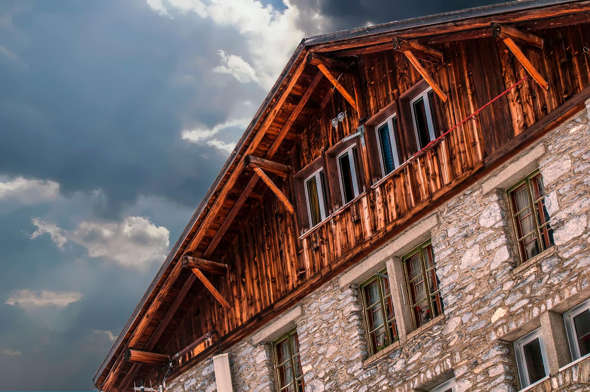
Photo by Frans van Heerden
By understanding the farmhouse aesthetics’ core principles and its historical context, it’s easy to see why it’s so adaptable and enduring.
This knowledge doesn’t just guide color choices. It connects us to a time where function and beauty existed side by side, creating homes meant to be cherished.
Check out 10 Common Mistakes to Avoid in Rustic Farmhouse Decor.
Popular Farmhouse Paint Colors
Choosing the right paint colors for a farmhouse-style home can evoke warmth, nostalgia, and simplicity.
These hues work to elevate that cozy, lived-in appeal while emphasizing natural light and character.
Whether you lean towards the traditional palette or want to experiment with new tones, there’s plenty of versatility in farmhouse paint colors.
My Favorite Sherwin-Williams Farmhouse Colors:
- Pewter Green (SW 6208)
A deep, moody green perfect for accents, cabinets, or creating natural warmth in farmhouse decor. - Crushed Ice (SW 7647)
A light, neutral gray with soft undertones, great for achieving a modern farmhouse vibe. - Alabaster (SW 7008)
A timeless, warm white that works beautifully for walls or trim, adding softness and warmth. - Upward (SW 6239)
A calm, breezy blue and the 2024 Color of the Year. It pairs beautifully with wooden farmhouse textures. - Shoji White (SW 7042)
An off-white with subtle beige undertones, perfect for blending vintage and modern farmhouse designs. - Iron Ore (SW 7069)
A dramatic, charcoal gray and often used for accent walls or exterior details. - Sea Salt (SW 6204)
A muted blue-green that evokes tranquility, ideal for bathrooms or light-filled rooms. - Tricorn Black (SW 6258)
A bold black that provides stunning contrast, especially for farmhouse doors or shutters.
Where to Use Them:
- Neutral tones like Crushed Ice and Alabaster can serve as a base for walls.
- Darker shades like Pewter Green and Iron Ore work well on cabinetry or trim.
- Accent colors like Sea Salt or Upward can be used in living rooms and kitchens.

For additional inspiration, explore the complete Sherwin-Williams Farmhouse Color Collection here.
Classic Whites and Off-Whites
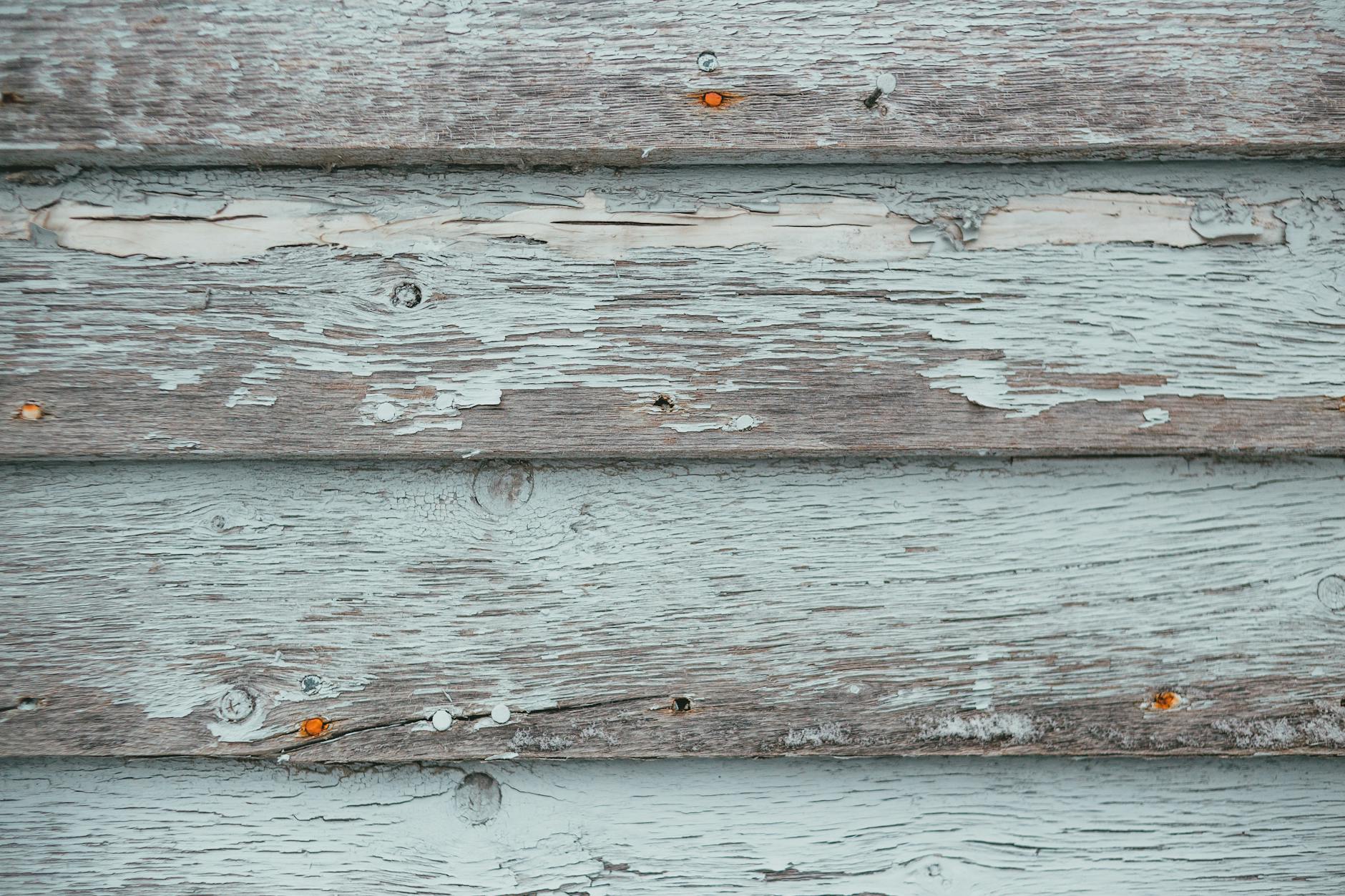
Photo by Erik Mclean
When it comes to farmhouse design, white is the reigning champion and for good reasons!
Classic whites and off-whites not only make spaces look larger and brighter but also create a clean, calming environment.
These tones provide a neutral backdrop, allowing other elements like wood accents or vintage furnishings to take center stage.
Popular examples include hues like Benjamin Moore Simply White or Sherwin Williams Alabaster, both known for their soft, warm undertones.
For a slightly aged, rustic look, consider off-whites with a creamy or beige tint, such as Dover White.
These tones mimic the natural patina of old homes while blending effortlessly into modern interiors.
Want more painting inspiration? Check out this exhaustive farmhouse paint guide.
Soft Pastels for a Cozy Feel
For those who love subtle color, soft pastels add a gentle touch of personality without overpowering the farmhouse aesthetic.
Think pale blues, sage greens, or muted pinks that almost melt into the space while enhancing its coziness.
- Sage Green: A perfect nod to nature, this tone pairs beautifully with white trim or wooden beams.
- Duck Egg Blue: Delicate and muted, this shade works well in kitchens, bathrooms, or living spaces.
- Blush Pink: While unconventional, pale pinks like Farrow & Ball’s Pink Ground can be surprisingly versatile in farmhouse settings.
Pastels add depth and variation while maintaining that serene, country vibe.
Bold and Dark Shades
Farmhouse design isn’t all about light and airy tones. Sometimes, bold and dark shades can provide striking contrast, adding drama and modern sophistication to rustic spaces.
Navy blue, forest green, and charcoal gray are popular choices for accent walls, cabinetry, or even entire rooms.
- Navy Blue: Timeless and elegant, this shade pairs naturally with crisp white and warm wood tones. It’s ideal for dining rooms or bedrooms.
- Forest Green: Earthy and grounding, forest green enhances the organic elements of farmhouse design.
- Charcoal Gray: Perfect for modern farmhouse interiors, this dramatic tone balances sophistication with coziness.
Using darker colors sparingly ensures they don’t overwhelm a room’s aesthetic. They’re an excellent way to make unique architectural details stand out.
Choosing the Right Color Palette
Your farmhouse wall color journey begins with choosing the perfect palette that sets the tone for the entire space.
Choosing the right color palette goes beyond aesthetics; it’s about creating a homey atmosphere that speaks to warmth, comfort, and timeless design.
Let’s uncover how to find hues that flow effortlessly within your farmhouse design.
Factors to Consider When Choosing Colors
There are several practical factors that should influence your color palette decisions. After all, selecting the right shade is as much about functionality as it is about beauty.
- Room Size: Smaller rooms benefit from lighter shades. White, beige, or other neutral tones can make a space feel more open and airy.
- Natural Light: Does the area receive plenty of sunshine, or is it naturally dim? Bright, sunlit rooms can handle cooler or darker hues, while dimmer areas may thrive with warm undertones.
- Existing Decor: Consider the existing furniture and materials in your space. Wood accents, vintage pieces, and textiles should complement the chosen palette, not clash with it.

Photo by RDNE Stock project
Creating Harmony with Color Combinations
In a farmhouse aesthetic, harmony is everything. A well-chosen color combination can make a home feel warm, inviting, and cohesive.
To master this, consider these tips:
- Stick to Neutrals as a Base: Whites, creams, and light grays create a soft canvas for farmhouse interiors.
- Add Natural Hues: Complement neutrals with warm, earthy tones like sage green, muted yellow, or terracotta.
- Use the 60-30-10 Rule: Make the wall color your 60% (dominant color), use complementary and secondary hues for 30%, and let bold accent tones occupy just 10% of your design. This ensures a cohesive design across the room.
Thoughtfully blending colors guarantees that every detail, no matter how small, feels intentional while reflecting the timeless charm of farmhouse decor.
Pro Tips for Painting Farmhouse Walls
Painting your farmhouse walls is more than just applying a fresh coat of color; it’s about creating a space that reflects comfort.
Whether you’re reviving a historic home or embracing the farmhouse aesthetic in a modern space, taking the right steps can make all the difference. Here’s how you can get it right.

Photo by Malte Luk
Preparation is the cornerstone of any successful painting project. Skipping these steps can result in uneven finishes, peeling, or mismatched colors.
Here’s a helpful checklist to get you started:
- Clean the Walls: Dust and grime can interfere with paint adhesion. Wipe down walls using a mild soap solution and let them dry completely.
- Fix Cracks and Holes: Use spackle or joint compound to fill in imperfections, then sand the surface smooth.
- Tape and Protect: Apply painter’s tape along trim, windows, and baseboards. Use drop cloths to protect furniture and floors.
- Prime the Walls: A good primer not only ensures durability but also prevents stains from seeping through. For a farmhouse look, consider primers that work well with neutral or pastel top coats.
- Choose the Right Tools: A mix of brushes, rollers, and edging tools will help you achieve precise application.
These steps might feel tedious, but they save time and money in the long run.
Need additional inspiration for revamping your home on a budget? Check out these simple hacks to refresh your home.
Final thoughts on Farmhouse Paint Colors
Selecting the right paint colors will act as the foundation for your farmhouse decor, influencing the mood and overall atmosphere of the room.
Whether you’re drawn to classic neutrals, subtle pastels, or bold accents, the choice is yours!
Start by exploring cohesive combinations that work harmoniously with natural materials often found in farmhouse decor.
Whether you’re revamping an old family home or designing a brand-new space, remember that your wall colors act as the backdrop that ties everything together.
More posts like this: