
Picking the right color for your kitchen cabinets does more than modernize your space. It shapes how the room feels!
Cabinet color choices set the tone, whether you want something inviting, bright, or cozy.
Some colors can bring in more light and make a small space seem bigger, while others offer warmth and welcome.
Understanding the effect of color helps you put together a kitchen that looks good and works well. For other creative color ideas, see these boho-inspired palettes.
Why Keeping Up with Cabinet Color Trends Matters
Kitchen cabinet trends move quickly. Designers and homeowners update their spaces as new shades pop up in showrooms and magazines.
Staying current is more than following fashion. A fresh-painted cabinet can add personality and value while making your kitchen feel more modern.
The next time you want to renovate your kitchen, start with the cabinets. That alone will bring life back into your kitchen.
White Cabinets: Clean, Bright, and Always in Style
White cabinets never go out of style. They brighten kitchens and reflect light, making rooms feel airy and large. White works almost anywhere, from a classic farmhouse to a sleek, modern space.
Why do so many choose white cabinets?
- Maximize light
- Create a larger feel in tight spaces
- Mix easily with backsplashes and bold appliances
If you want more on the benefits and drawbacks, check out these pros and cons of white cabinets.
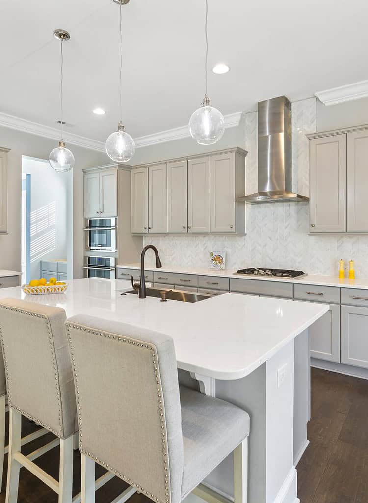
Soft Gray: Modern and Adaptable
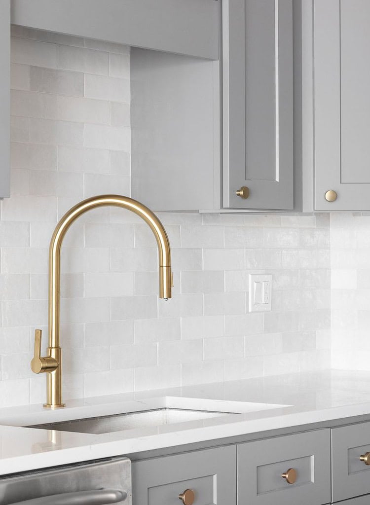
Gray cabinets are gaining fans who want something softer than white but still fresh. Gray fits both modern and traditional kitchens. It hides fingerprints and marks better than bright white, which helps with upkeep.
Gray stands out because it:
- Works well with bright or natural wood accents
- Fits both bold and subtle color schemes
- Keeps kitchens looking up-to-date
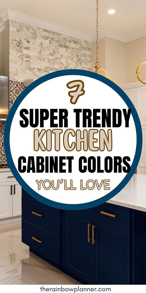
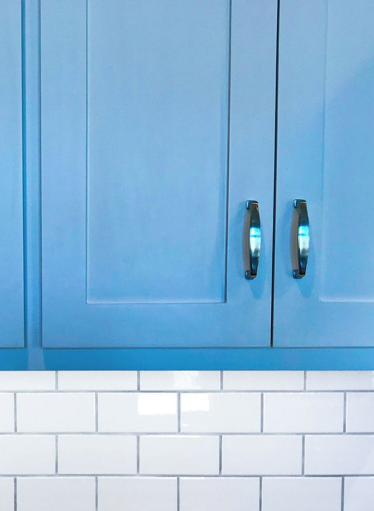
Navy Blue: Bold and Timeless
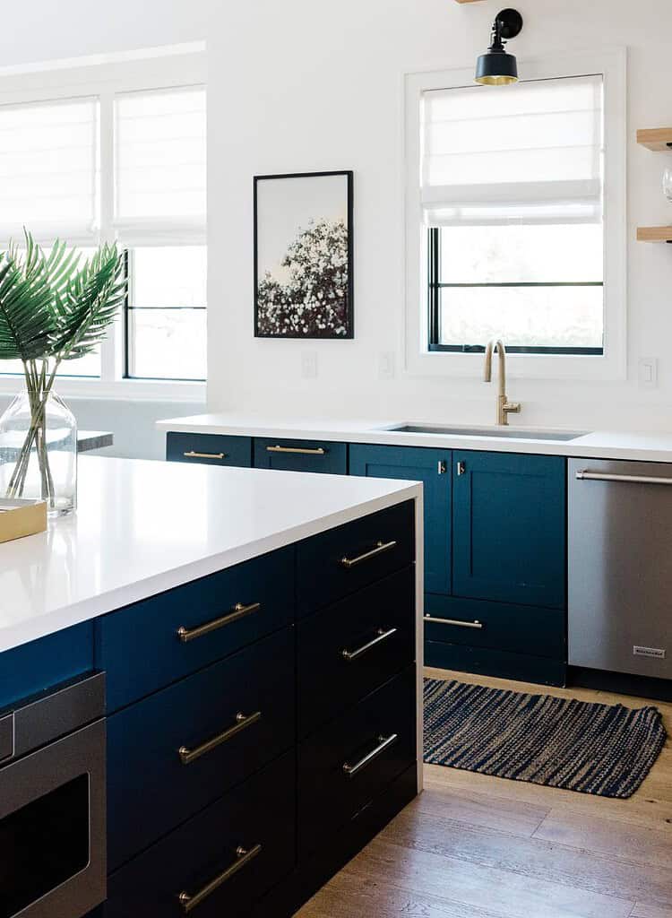
Navy blue cabinets continue to turn heads. This deep shade adds personality without going overboard. It suits multiple looks, including vintage, urban, and coastal kitchens. Navy serves as a grounding element and pairs well with white, gold, or wood accents.
Why choose navy blue?
- Offers contrast to lighter counters and walls
- Makes cleaning easier since marks show less
- Gives a classic look with a modern twist
If dramatic blues appeal to you, see these navy blue kitchen ideas.
Forest Green: Earthy and Calming
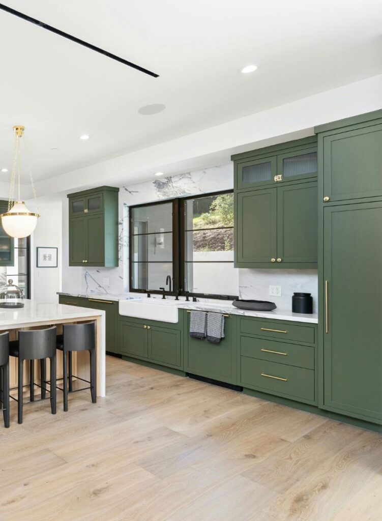
Forest green is making a mark as a color that pulls nature indoors. It feels serene, perfect for creating a retreat from daily stress. Green pairs beautifully with wood accents, white tiles, and warm hardware.
Highlights of forest green cabinets:
- Provide a calm, soothing atmosphere
- Match well with natural wood and brass details
- Blend a classic feel with modern flair
Check out these kitchens using dark green for even more inspiration.
Warm Taupe: Inviting and Versatile
Warm taupe makes a kitchen feel comfortable and lived-in. It works with both shiny metals and rustic wood. Taupe can soften the effect of bold counters or backsplashes while fitting a range of design styles.
Why homeowners like taupe:
- Creates a cozy vibe without feeling cold
- Blends into modern, rustic, and classic kitchens
- Feels current while staying understated
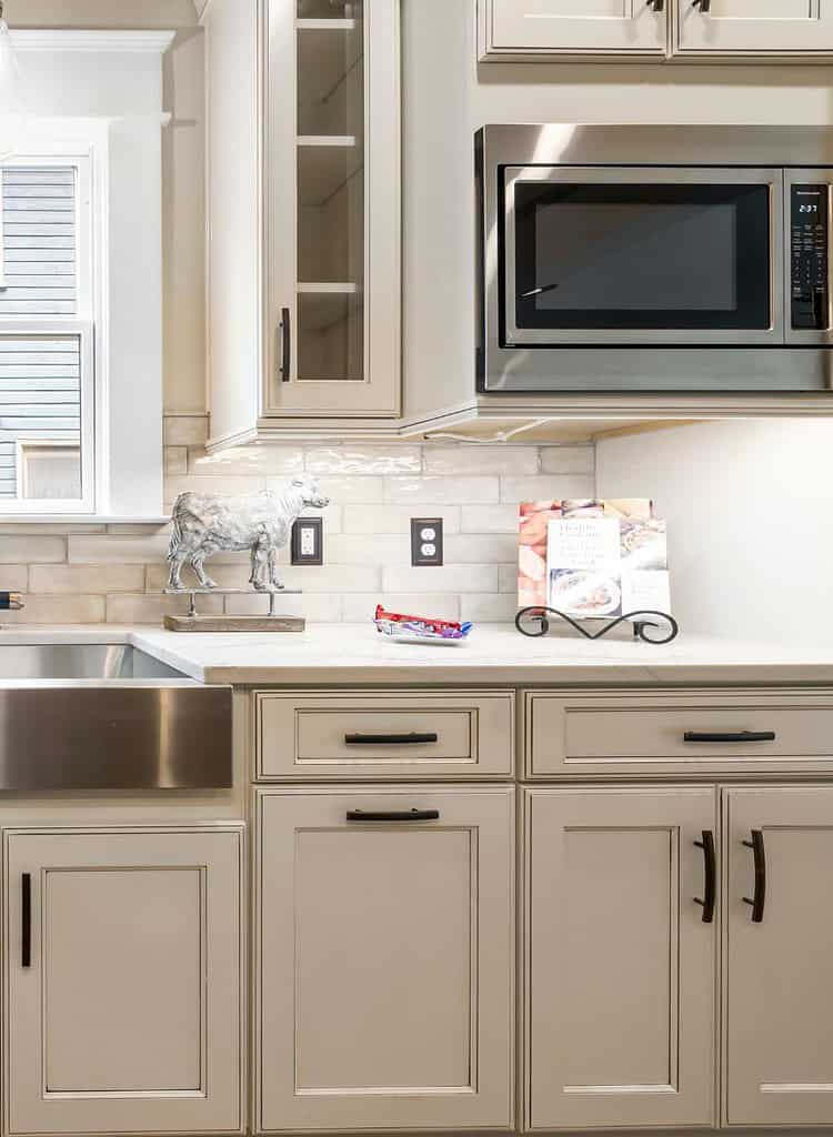
Creamy Beige: Warm and Timeless
Creamy beige cabinets soften the look of any kitchen. This shade brings in warmth and helps reduce the harsh effect of intense lighting or appliances. Beige has staying power and continues to look good as trends shift.
The appeal of creamy beige:
- Offers lightness without feeling stark
- Matches most wood, stone, and hardware choices
- Maintains a fresh appearance for years
Studio McGee recommends accessible beige for a balanced mix of modern and classic.
Two-Tone Cabinets: Depth and Visual Interest
Mixing cabinet colors isn’t just a passing style. It adds visual depth and a designer touch. Two-tone choices let you play with color without overpowering the space.
A common approach is using dark shades for lower cabinets and lighter ones above. This draws the eye upward, making the room feel bigger and lighter. Darker bases also hide more mess and scuffs.
Try combos like:
- Navy base with white uppers
- Charcoal lowers with pale gray tops
- Forest green and creamy ivory
See more two-tone cabinet ideas here.
Accent islands are another way to use color. Painting the island a bold shade, such as navy, green, or coral, turns it into a focus for the kitchen. It’s easy to tie in with stools or lighting for a unified look.
Soft Pastels: Fresh and Light
Pastel cabinet colors are gaining ground in kitchens this year. Soft blues and greens create a calm, welcoming space. These hues are especially useful in smaller kitchens, where they open things up and magnify natural light.
Popular pastel choices:
- Light blue for a clean, peaceful feel
- Mint or sage green for a touch of the outdoors
Pastels work well with light wood, white counters, and gold or black hardware. They reflect light and make rooms feel larger, which can be a big help in tight spaces.
Discover more pastel kitchen ideas and see how gentle color can brighten your home.
How to Choose the Best Cabinet Color
Picking a cabinet color should be practical and personal. Look at your kitchen’s size, how much light it gets, and your overall decor. The right color fits the way you live and makes the space work for you.
- For small kitchens, light shades like white, beige, or soft pastel help open up the space. Dark cabinets work best as an accent or in lower cabinets to avoid feeling cramped.
- If your kitchen is large, you have more freedom to use rich or deep shades like navy or forest green, but balance them with lighter elements so the room doesn’t feel heavy.
- Lighting changes how colors look. Lots of daylight makes bold shades brighter. Limited natural light means softer colors work better. Always test your chosen color in different spots and times of day.
- Your home’s style matters. Modern spaces look good with gray, navy, or sharp two-tone cabinets. Traditional homes favor cream, taupe, or classic wood finishes. Eclectic or boho styles can make use of greens, blush pinks, and even cheerful yellow.
- Think about how your cabinets will look with the counters, floor, and hardware. Choose contrasting shades so nothing blends together too much. Match undertones—warm with warm, cool with cool—for a unified feel.
Always test paint samples in the real space, using large boards or stick-on swatches. Live with them for a few days and look at them in a different light. For more advice, read this guide for choosing cabinet paint color.
Final Thoughts on Cabinet Color Ideas
Trendy kitchen cabinet colors favor warmth, personality, and a connection to nature. Greens, blues, pastels, and two-tone choices help kitchens feel both lively and grounded.
Even a simple color update can lift your mood and give your home a welcome boost.
If you’re thinking of changing things up, start with samples and trust your taste. What color will make your kitchen feel most like home?
Share your choices in the comments, and look out for more design tips soon.